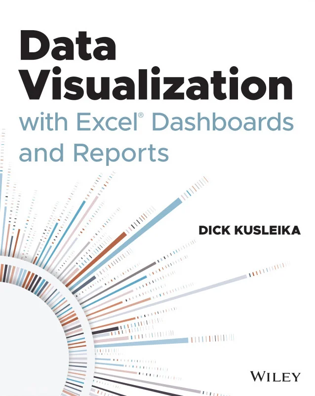
Data Visualization with Excel Dashboards and Reports
Turn Excel data into clear dashboards, reports, and visual decisions
Created by Dick Kusleika
Learn how to transform raw Excel data into clear dashboards and reports that highlight key business metrics. You'll discover practical techniques for organizing, visualizing, and communicating insights to support better decision-making. By the end, you'll be able to present complex information in a way that makes sense for any audience.
Wiley | Sep 2026 | 352 min
What You Will Learn
You will start by understanding when dashboards are the right tool and how to select meaningful KPIs. Step by step, you'll assemble and prepare data using Excel features, then move on to building visual reporting layers. Real-world case studies help you practice layout, chart selection, and formatting for different business scenarios.
Key Features
- Plan dashboards that connect user needs, KPIs, and effective layout choices
- Combine PivotTables, formulas, and tables for dynamic Excel reporting
- Apply visualization principles to create clear, actionable KPI displays
Target Audience
This course is ideal for Excel users, analysts, report builders, managers, and operations professionals who want to design dashboards, present KPIs, and create clearer reports. If you already work with spreadsheet data and want to communicate insights more effectively, you'll find practical skills to level up your reporting.