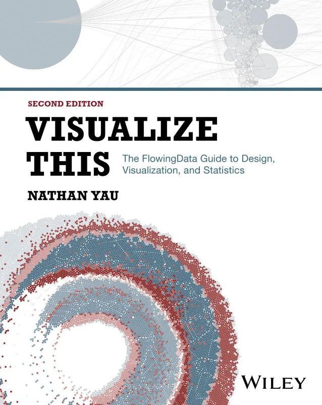
Visualize This
The FlowingData Guide to Design, Visualization, and Statistics
Created by Nathan Yau
Learn how to turn raw data into clear, engaging visuals that tell a story. Explore practical techniques for preparing data, selecting the right charts, and designing graphics that communicate insights effectively. Build a strong foundation in both the tools and thinking behind great data visualization.
Wiley | Sep 2026 | 384 min
What You Will Learn
You will start by exploring how to ask the right questions and choose the right tools for your data. Step by step, you will learn to prepare and process datasets, experiment with different chart types, and map spatial patterns. Each section connects visual choices to real data problems, making concepts easy to apply.
Key Features
- Build confidence in preparing and processing datasets for visualization projects
- Select and use the right charts for time, categories, relationships, and spatial data
- Design visuals that clearly communicate insights and support data-driven storytelling
Target Audience
Perfect for beginners in data analysis, design, journalism, or research who want to make data more understandable. If you are looking to compare visualization tools, prepare and organize data, or present findings with clarity, you will find practical guidance and hands-on examples tailored to your needs.