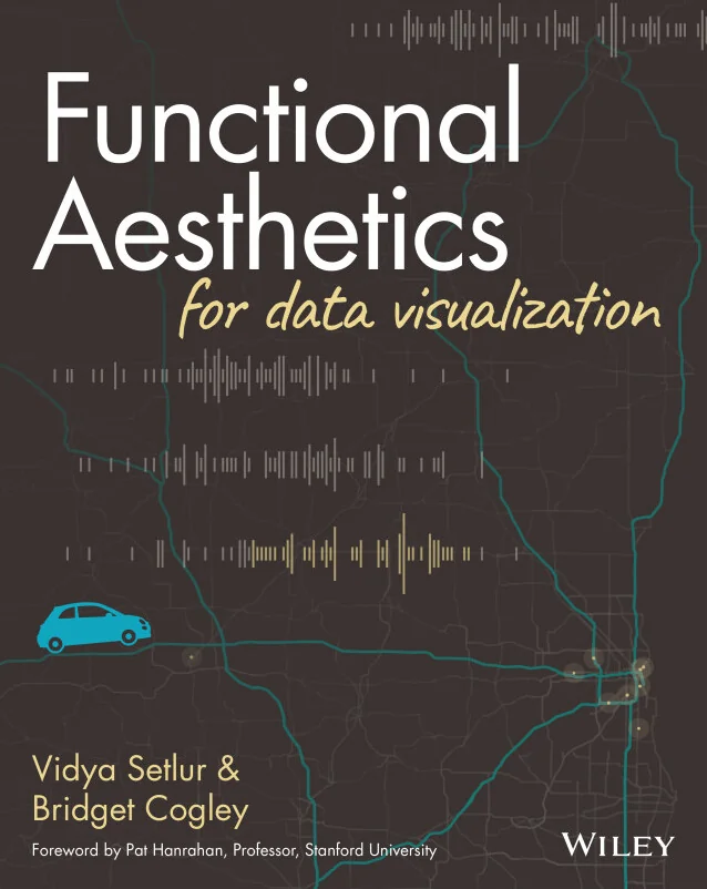
Functional Aesthetics for Data Visualization
Design meaningful, accessible charts grounded in perception and intent
Created by Vidya Setlur, Bridget Cogley
Explore how perception, semantics, and intent shape effective data visualizations. Learn to design charts that are not only visually appealing but also meaningful and accessible. Build practical skills to create visuals that communicate data clearly and support better understanding.
Wiley | Sep 2026 | 336 min
What You Will Learn
You will start by exploring how people perceive color, space, and attention in charts. Then, you will connect these insights to the language and semantics of data visuals. Each section builds practical judgment for making design choices that improve clarity, accessibility, and overall impact.
Key Features
- Apply perception science to make charts more intuitive and engaging
- Integrate text and visuals for accessible, cohesive data communication
- Prepare and design charts that clarify meaning and support user intent
Target Audience
Ideal for data visualization designers, analysts, educators, and anyone responsible for communicating data. If you already understand basic chart types and want to create visuals that are both functional and visually effective, this course will help you take your skills to the next level.