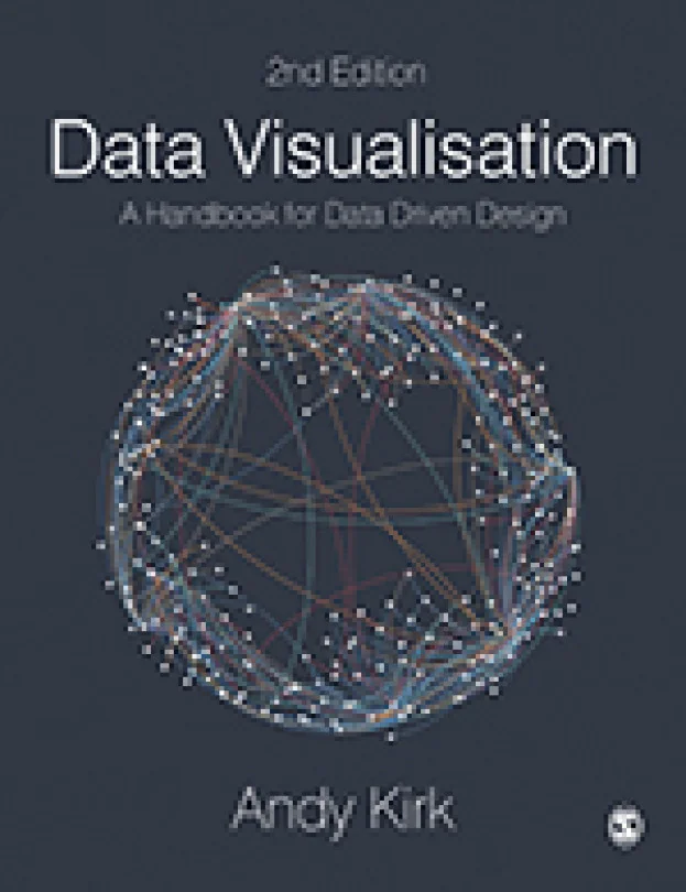
Data Visualisation
An In-Depth Guide to the Art and Science of Data Representation
Created by Andy Kirk
Explore the art and science of turning complex data into clear, engaging visuals. Learn how to design impactful graphics, choose the right visual elements, and apply color and interactivity for better communication. Build skills that help you present data-driven stories with confidence.
Sage Publishing | Jul 2026 | 328 min
What You Will Learn
You will start by learning foundational design principles and gradually move on to advanced techniques for working with real-world datasets. Through hands-on projects and practical examples, you will practice selecting the right visuals, applying color theory, and adding interactivity to make your data presentations more engaging and informative.
Key Features
- Develop the ability to design clear, effective data visualizations for any audience
- Master techniques for using color, annotation, and interactivity to enhance your visuals
- Gain practical experience in transforming raw data into compelling visual stories
Target Audience
Perfect for designers, analysts, and professionals who work with data and want to improve their visualization skills. If you already understand basic data analysis and design concepts, you will find clear guidance to help you create more meaningful and visually appealing data presentations.