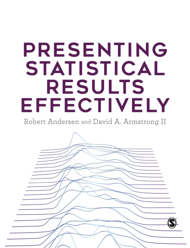
Presenting Statistical Results Effectively
Effective Visualization and Presentation Techniques for Statistical Data
Created by David A. Armstrong II, Robert Andersen
Learn how to turn complex statistical data into clear, compelling visuals and presentations. Discover practical techniques for building effective tables and graphs, and gain confidence in communicating your results to any audience. Build skills that help make your statistical findings both accurate and easy to understand.
Sage Publishing | Jul 2026 | 456 min
What You Will Learn
You will work through real-world examples that show how to design visuals and interpret statistical results. Step by step, you will learn to choose the right type of graph or table, understand how people perceive data, and apply proven methods for presenting complex information clearly. Each topic builds practical skills you can use immediately.
Key Features
- Create clear tables and graphs that highlight key statistical results
- Visualize relationships and distributions for both categorical and quantitative data
- Interpret and present linear and generalized linear model outcomes with confidence
Target Audience
This course is designed for data analysts, researchers, statisticians, and students who already understand basic statistics. If you want to improve how you present data and make your findings more accessible, this is for you. You do not need advanced statistical knowledge, just a desire to communicate results more effectively.